Fokker-Planck diagram
Summary
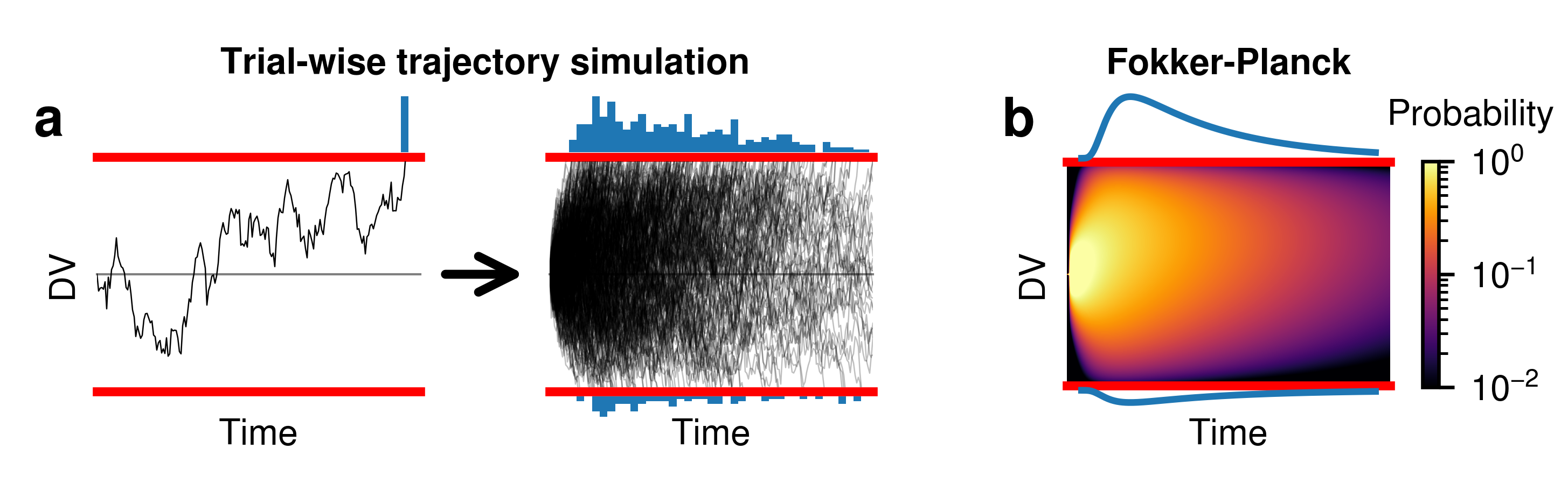
Here, we will show how to build the schematic for Fokker-Planck, as seen in Figure 3 from Shinn et al. 2020.
Setting up the figure
First, we import the plotting libraries and define some basic properties:
import ddm # Requires PyDDM to be installed
from ddm import *
import matplotlib.pyplot as plt
import numpy as np
import seaborn as sns
from cand import Canvas, Point, Width, Height, Vector
Next, we set up the canvas and define the three main axes we will use, the arrow in between, and some basic axis labels. Note that this does not yet define the histograms/distributions shown on the top and bottom of these axes.
c = Canvas(4.85, 1.5)
c.set_font("Nimbus Sans", size=8)
c.set_default_unit("absolute")

c.add_axis("trial", Point(0.3, 0.3), Point(1.3, 1))
c.add_axis("trials", Point(1.7, 0.3), Point(2.7, 1))
c.add_axis("fp", Point(3.3, 0.3), Point(4.3, 1))
c.add_arrow(Point(1.05, 0.5, "trial"), Point(-0.05, 0.5, "trials"))
c.add_text(
    "DV",
    Point(0, 0.5, "axis_trial") - Width(0.05, "absolute"),
    horizontalalignment="right",
    verticalalignment="center",
    rotation="vertical",
)
c.add_text(
    "Time",
    Point(0.5, 0, "axis_trial") - Height(0.15, "absolute"),
    horizontalalignment="center",
    verticalalignment="center",
)
c.add_text(
    "Time",
    Point(0.5, 0, "axis_trials") - Height(0.15, "absolute"),
    horizontalalignment="center",
    verticalalignment="center",
)
c.add_figure_labels([("a", "trial"), ("b", "fp")])
Now, we create a function which will add histograms or plots of the pdf on the top and bottom of these axes. We set it up as a function which accepts the name of the axis. We use the “shift” argument to fine tune the positioning, since matplotlib misaligns the histograms for some reason.
def finalize_hists(axname):
    c.ax(axname + "_bot").set_ylim(c.ax(axname + "_top").get_ylim())
    c.ax(axname + "_bot").invert_yaxis()
This function also operates on an axis. It runs formatting functions which must be applied after everything is already plotted, such as flipping the bottom axis on the lower histogram.
def add_hists(axname, shift=True):
    c.add_axis(
        axname + "_top",
        Point(0, (1.04 if shift else 1), "axis_" + axname),
        Point(1, 1.3, "axis_" + axname),
    )
    c.add_axis(
        axname + "_bot",
        Point(0, -0.3, "axis_" + axname),
        Point(1, (-0.04 if shift else 0), "axis_" + axname),
    )
    c.ax(axname).axis("off")
    c.ax(axname + "_top").axis("off")
    c.ax(axname + "_bot").axis("off")
Define the model:
T_dur = 2
model = Model(drift=ddm.DriftConstant(drift=0.8), dt=0.01, dx=0.01)
Plot trajectories on the axis. We abstract this into a function so that we can run it twice, once for the plot with only one trajectory, and once for the plot with multiple trajectories.
def draw_trials(model, axname, N=1, seedstart=7, alpha=1):
    # Create three-rowed figure
    add_hists(axname)

    # Draw DDM axes
    ax = c.ax(axname)
    ax.plot([0, T_dur], [0, 0], c="gray", clip_on=False, lw=0.5)
    ax.plot([0, T_dur], [1.04, 1.04], c="red", clip_on=False, lw=2)
    ax.plot([0, T_dur], [-1.04, -1.04], c="red", clip_on=False, lw=2)
    # sns.despine(bottom=True, ax=ax_main)
    ax.get_xaxis().set_ticks([])
    ax.get_yaxis().set_ticks([])
    ax.axis([0, T_dur, -1, 1])

    # Draw paths and the corresponding histogram
    corr_times = []
    err_times = []
    for seed in range(seedstart, N + seedstart):
        Y = model.simulate_trial(seed=seed)
        X = model.t_domain()
        X = X[0 : len(Y)]
        if Y[-1] > 1:
            corr_times.append(X[len(Y) - 1])
        elif Y[-1] < -1:
            err_times.append(X[len(Y) - 1])
        ax.plot(X, Y, linewidth=0.3, c="k", alpha=alpha)

    c.ax(axname + "_top").hist(corr_times, bins=41, range=(0, model.T_dur))
    c.ax(axname + "_bot").hist(err_times, bins=41, range=(0, model.T_dur))
    finalize_hists(axname)
    c.ax(axname + "_top").set_xlim(-0.025, T_dur + 0.025)
    c.ax(axname + "_bot").set_xlim(-0.025, T_dur + 0.025)


# One trial
draw_trials(model, "trial", N=1, seedstart=8)

# Several trials
# Note that this step is slow
draw_trials(model, "trials", N=400, seedstart=0, alpha=0.25)
Now we build the heatmap (grid) showing the evolution of the drift diffusion model under Fokker-Planck based methods. We build it into a function and call it once for the correct axis.
add_hists("fp", shift=False)
s = model.solve_numerical_implicit(return_evolution=True)
grid = np.sqrt(s.pdf_evolution())
Now, we create the distributions on the top and bottom of the heatmap, along with the appropriate labels.
s = model.solve_numerical_implicit()
top = s.pdf_corr()
bot = s.pdf_err()
# Show the relevant data on those axes
c.ax("fp").imshow(
    np.log10(grid ** 2 + 1e-5),
    aspect="auto",
    interpolation="bicubic",
    cmap="inferno",
    vmin=-2,
    vmax=0,
)
c.ax("fp").invert_yaxis()
c.ax("fp_top").plot(np.linspace(0, len(top) - 1, len(top)), top, clip_on=False)
c.ax("fp_bot").plot(np.linspace(0, len(top) - 1, len(bot)), bot, clip_on=False)
c.add_text(
    "DV",
    Point(0, 0.5, "axis_fp") - Width(0.05, "absolute"),
    horizontalalignment="right",
    verticalalignment="center",
    rotation="vertical",
)
c.add_text(
    "Time",
    Point(0.5, 0, "axis_fp") - Height(0.15, "absolute"),
    horizontalalignment="center",
    verticalalignment="center",
)
axsize = plt.axis()
c.ax("fp").plot(
    [-0.35, len(grid[0, :]) - 0.65], [1.0, 1.0], c="red", clip_on=False, lw=2
)
c.ax("fp").plot(
    [-0.35, len(grid[0, :]) - 0.65],
    [len(grid[:, 0]) - 1, len(grid[:, 0]) - 1],
    c="red",
    clip_on=False,
    lw=2,
)
plt.axis(axsize)
# Set axes to be the right size
finalize_hists("fp")
Additionally, we create a colorbar. We can’t use the “vmin” and “vmax”
arguments of the Canvas.add_colorbar() method because we want to create a
colorbar with log scaling. Thus, we have to create a matplotlib LogNorm
object.
cb_norm = plt.matplotlib.colors.LogNorm(vmin=1e-2, vmax=1)
cb = c.add_colorbar(
    "cbar",
    Point(1.1, 0, "axis_fp"),
    Point(1.15, 1, "axis_fp"),
    cmap="inferno",
    bounds=cb_norm,
)
cb.set_ticks([0.01, 0.1, 1])
c.ax("cbar").tick_params(axis="y", which="minor", right="off")
c.add_text("Probability", Point(3, 1.2, "axis_cbar"))
Finally, we add labels and save the figure.
Note that we determine the center position between the two leftmost plots using the “|” operator, which evaluates to be the center between any two Points.
cb_norm = plt.matplotlib.colors.LogNorm(vmin=1e-2, vmax=1)
cb = c.add_colorbar(
    "cbar",
    Point(1.1, 0, "axis_fp"),
    Point(1.15, 1, "axis_fp"),
    cmap="inferno",
    bounds=cb_norm,
)
cb.set_ticks([0.01, 0.1, 1])
c.ax("cbar").tick_params(axis="y", which="minor", right="off")
c.add_text("Probability", Point(3, 1.2, "axis_cbar"))